Work / KFC
KFC
Redesigning KFC's e-commerce experience by removing friction at key decision points.
2× purchase conversion after launch
Context
Competing with delivery platforms on their own turf
KFC wanted to strengthen its direct ordering channel against delivery platforms like Glovo and Uber Eats, which reduced both profit margins and direct customer relationships. At the same time, it was competing with brands such as McDonald's and Burger King, whose digital products had already set high user expectations.
Delivery orders also had a higher Average Order Value (AOV), around €23 compared to €15–16 across other channels, making every abandoned purchase significantly more expensive.
Project goal
Redesign key moments of the purchase journey to reduce friction, increase purchase completion, and strengthen KFC's direct channel.
Diagnosis
Three sources of evidence. One clear direction.
There was no budget for dedicated user research during the project. Instead of relying on assumptions, we combined three complementary sources of evidence to identify the biggest opportunities and prioritize design decisions.
- 01
Heuristic audit
Reviewed the existing experience to identify usability issues and friction throughout the purchase journey.
- 02
Competitive benchmark
Analyzed digital experiences from Glovo, Vicio, and Honest Greens to understand established interaction patterns and industry expectations.
- 03
Internal data
Validated design opportunities using business metrics and operational insights shared by the KFC team.
Key decision 01
Reducing exit points during the purchase flow
Findings
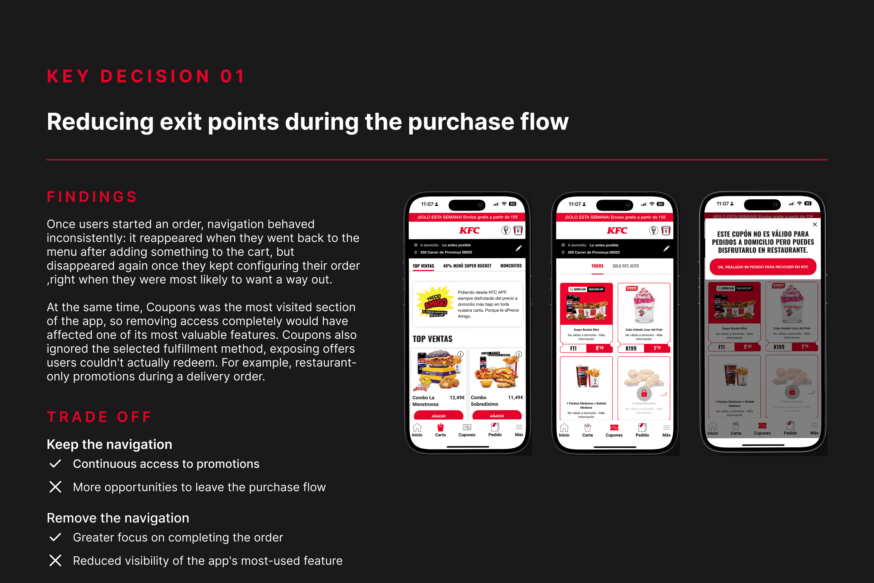
Once users started an order, navigation behaved inconsistently: it reappeared when they went back to the menu after adding something to the cart, but disappeared again once they kept configuring their order, right when they were most likely to want a way out.
At the same time, Coupons was the most visited section of the app, so removing access completely would have affected one of its most valuable features. Coupons also ignored the selected fulfillment method, exposing offers users couldn't actually redeem. For example, restaurant-only promotions during a delivery order.
Trade-off
Keep the navigation
- Continuous access to promotions
- More opportunities to leave the purchase flow
Remove the navigation
- Greater focus on completing the order
- Reduced visibility of the app's most-used feature
Decision
Keeping promotions accessible without breaking the purchase flow
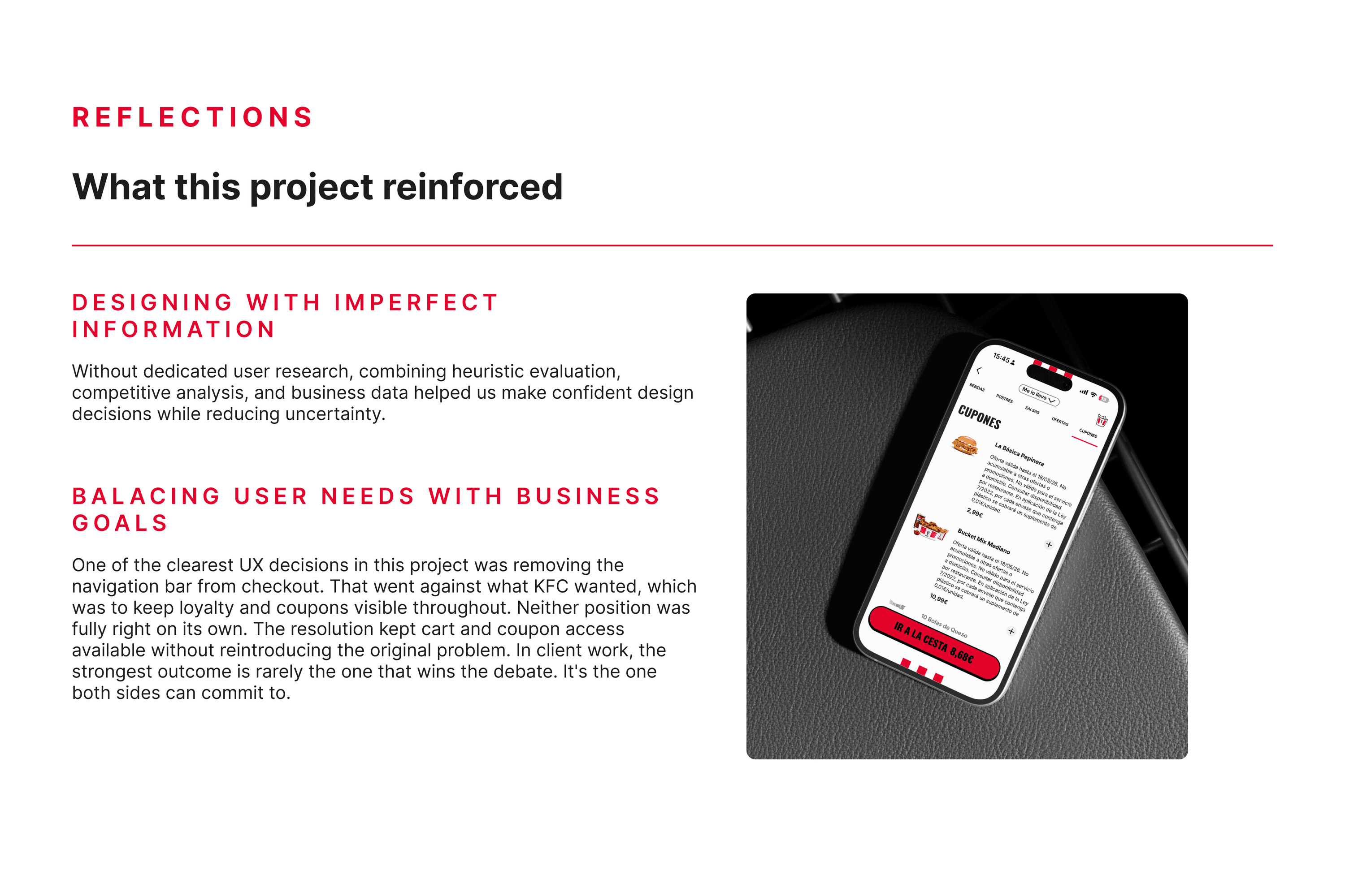
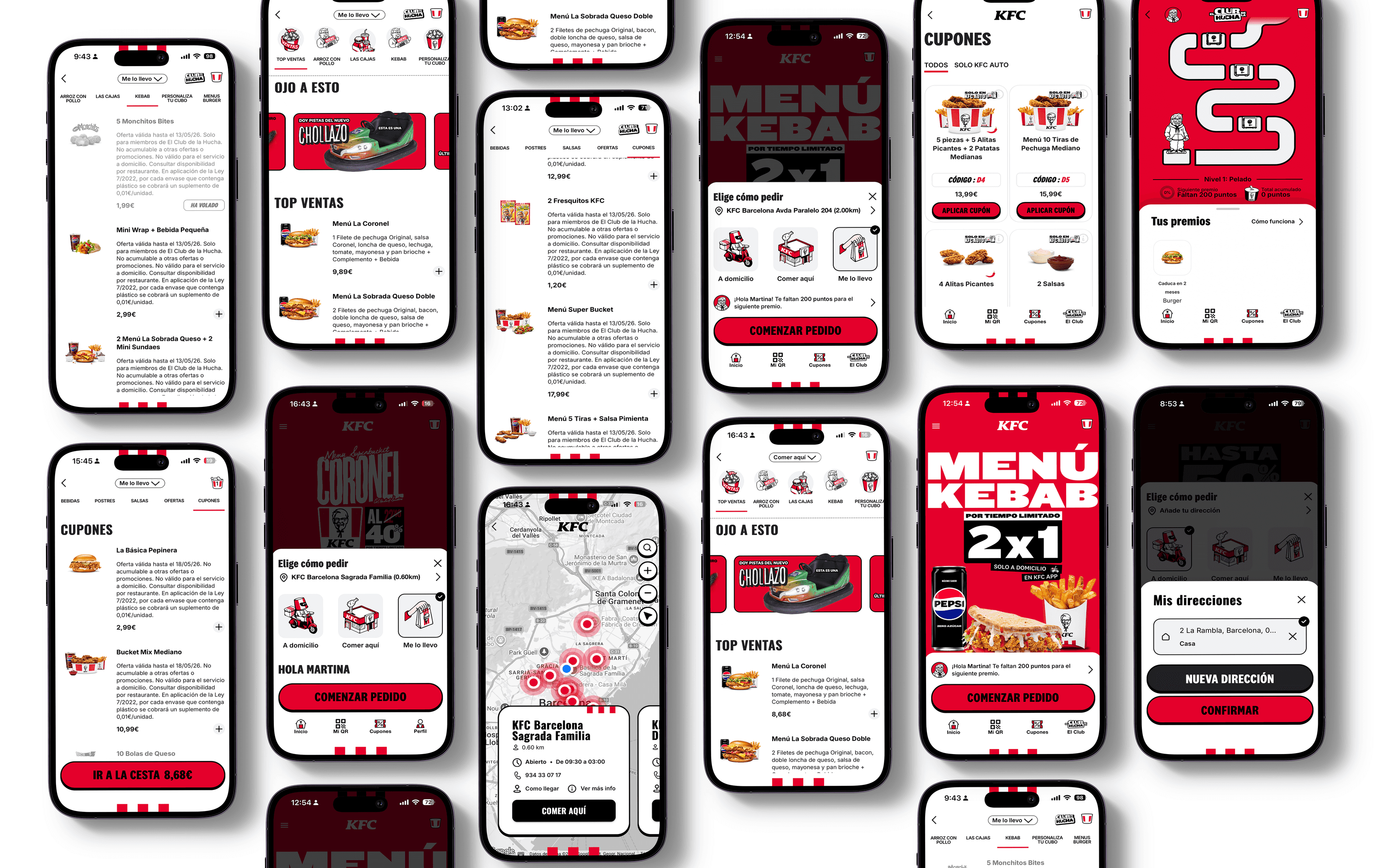
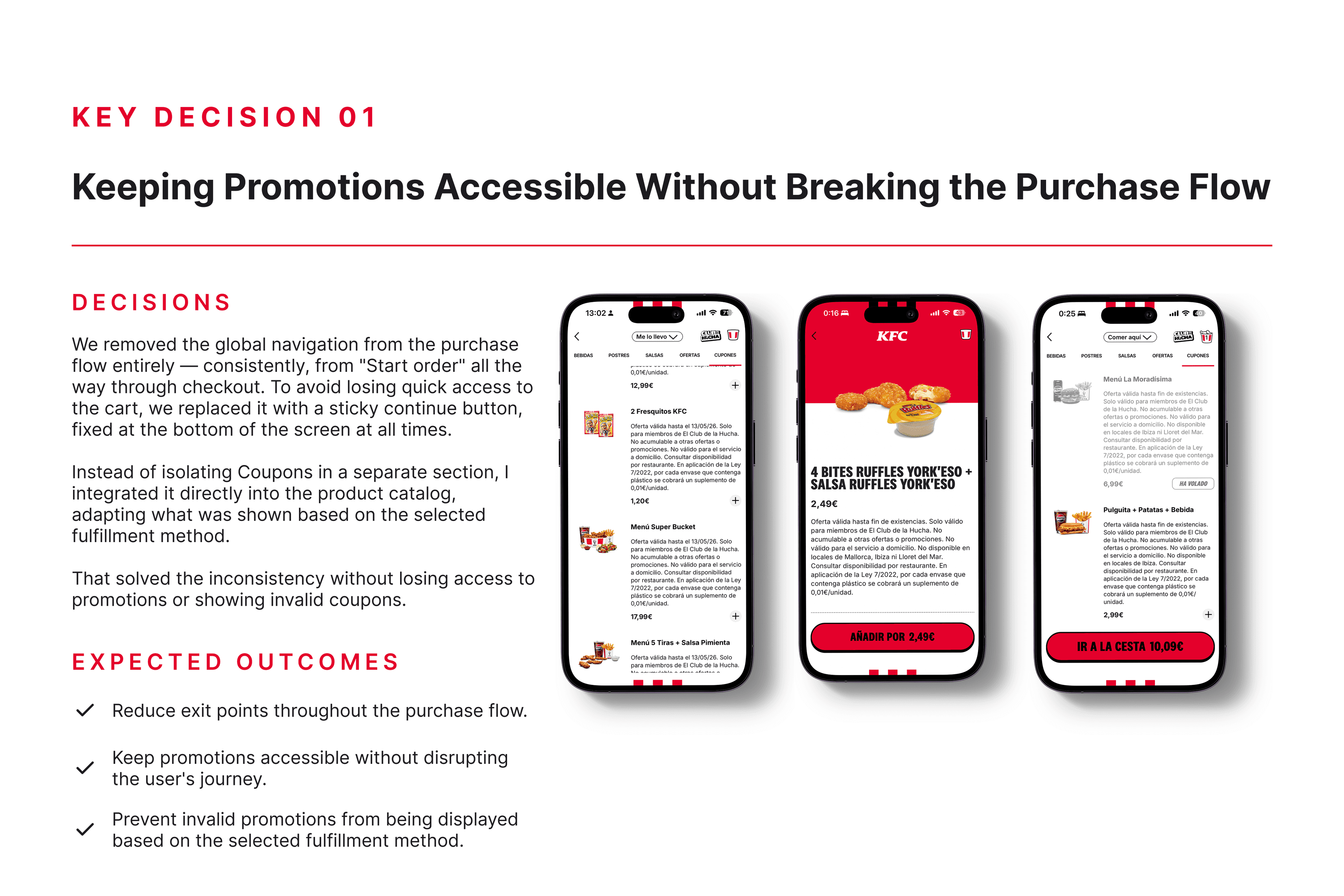
We removed the global navigation from the purchase flow entirely — consistently, from "Start order" all the way through checkout. To avoid losing quick access to the cart, we replaced it with a sticky continue button, fixed at the bottom of the screen at all times.
Instead of isolating Coupons in a separate section, I integrated it directly into the product catalog, adapting what was shown based on the selected fulfillment method.
That solved the inconsistency without losing access to promotions or showing invalid coupons.
Expected outcomes
- Reduce exit points throughout the purchase flow.
- Keep promotions accessible without disrupting the user's journey.
- Prevent invalid promotions from being displayed based on the selected fulfillment method.
Key decision 02
Confirming products the system couldn't deliver
Findings
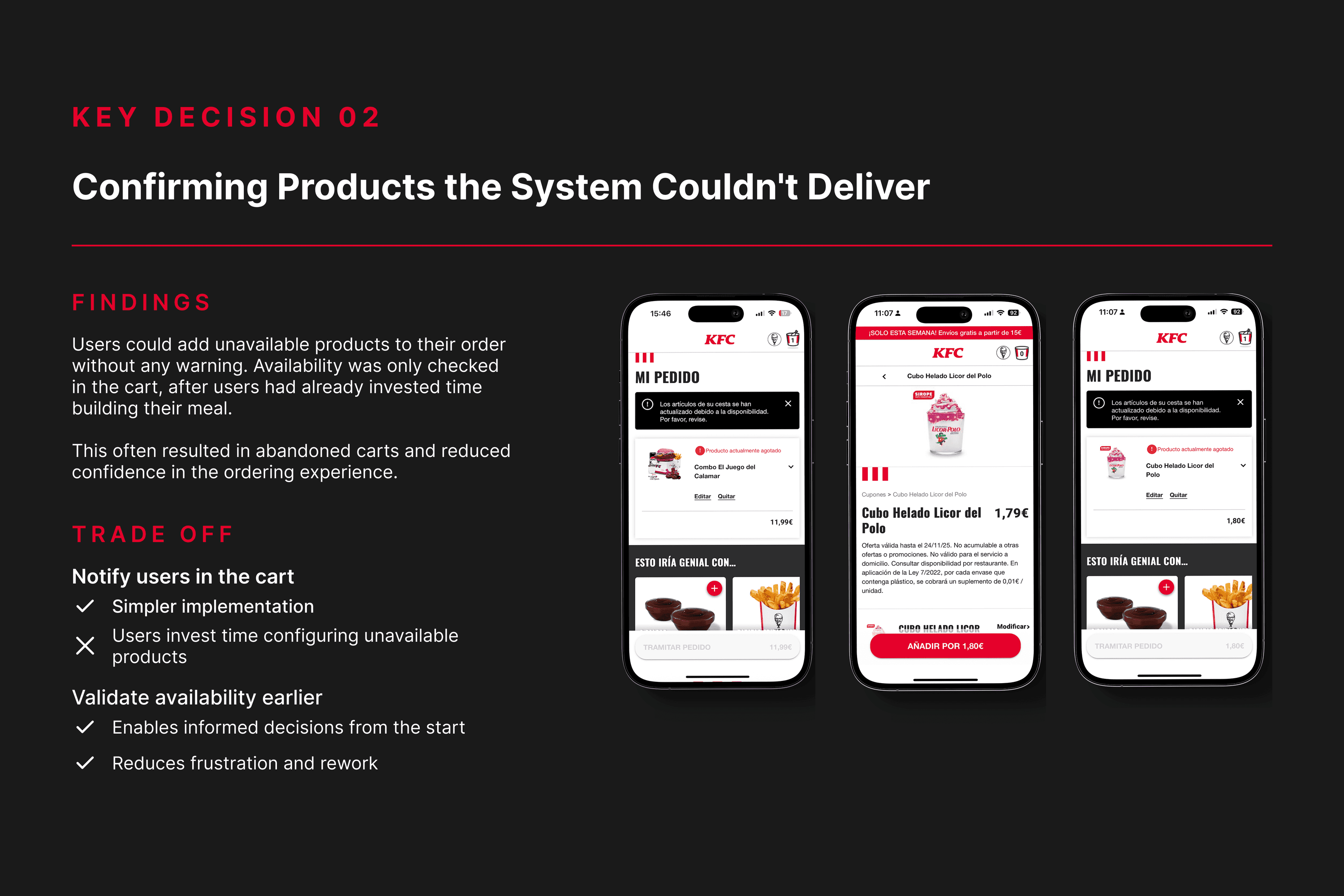
Users could add unavailable products to their order without any warning. Availability was only checked in the cart, after users had already invested time building their meal.
This often resulted in abandoned carts and reduced confidence in the ordering experience.
Trade-off
Notify users in the cart
- Simpler implementation
- Users invest time configuring unavailable products
Validate availability earlier
- Enables informed decisions from the start
- Reduces frustration and rework
Decision
Validating availability at the right moment
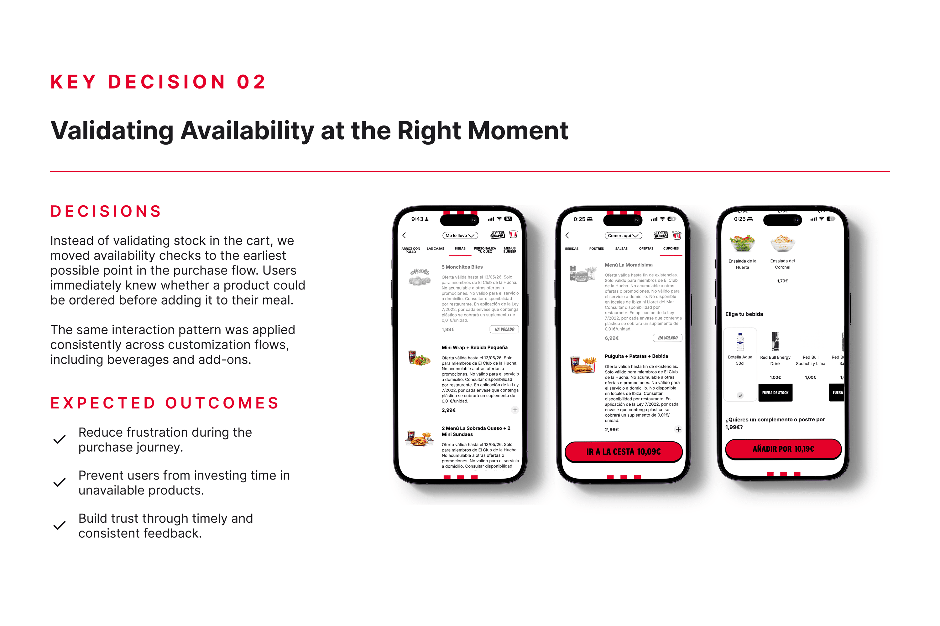
Instead of validating stock in the cart, we moved availability checks to the earliest possible point in the purchase flow. Users immediately knew whether a product could be ordered before adding it to their meal.
The same interaction pattern was applied consistently across customization flows, including beverages and add-ons.
Expected outcomes
- Reduce frustration during the purchase journey.
- Prevent users from investing time in unavailable products.
- Build trust through timely and consistent feedback.
Key decision 03
Removing repetitive steps for returning users
Findings
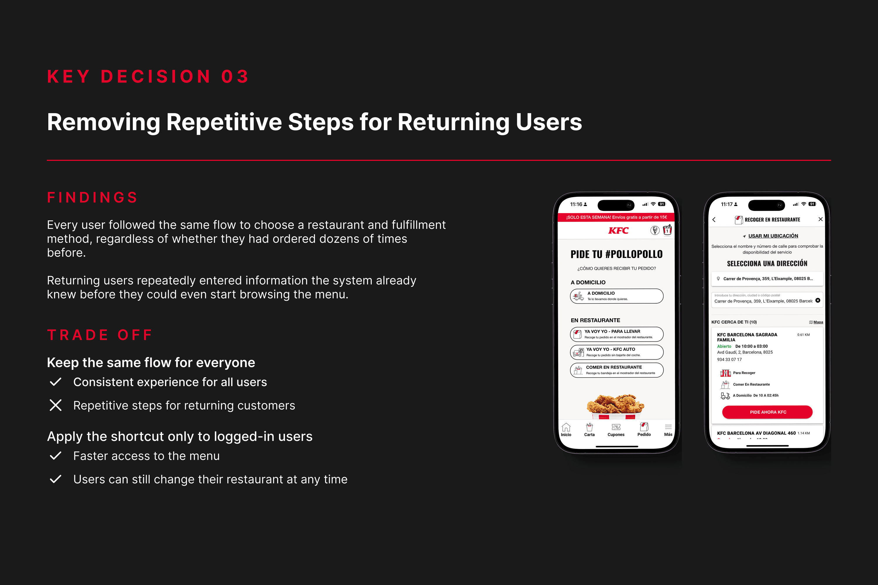
Every user followed the same flow to choose a restaurant and fulfillment method, regardless of whether they had ordered dozens of times before.
Returning users repeatedly entered information the system already knew before they could even start browsing the menu.
Trade-off
Keep the same flow for everyone
- Consistent experience for all users
- Repetitive steps for returning customers
Apply the shortcut only to logged-in users
- Faster access to the menu
- Users can still change their restaurant at any time
Decision
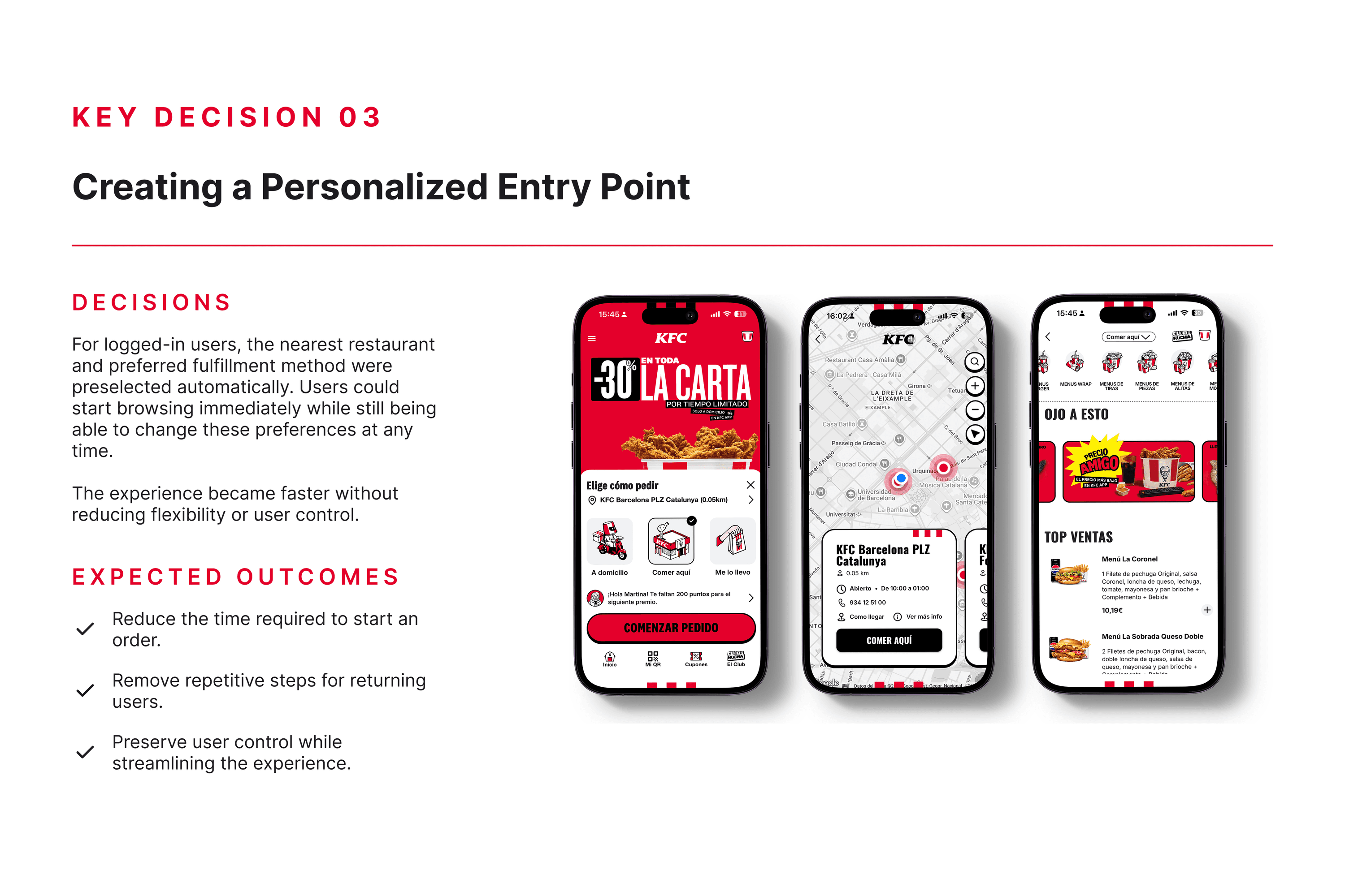
Creating a personalized entry point
For logged-in users, the nearest restaurant and preferred fulfillment method were preselected automatically. Users could start browsing immediately while still being able to change these preferences at any time.
The experience became faster without reducing flexibility or user control.
Expected outcomes
- Reduce the time required to start an order.
- Remove repetitive steps for returning users.
- Preserve user control while streamlining the experience.
Outcomes
Measurable impact after launch
2×
Purchase conversion
2×
Registrations
21% → 31%
Location flow completion rate
+40%
Logins
Reflections
What this project reinforced
Designing with imperfect information
Without dedicated user research, combining heuristic evaluation, competitive analysis, and business data helped us make confident design decisions while reducing uncertainty.
Balancing user needs with business goals
One of the clearest UX decisions in this project was removing the navigation bar from checkout. That went against what KFC wanted, which was to keep loyalty and coupons visible throughout. Neither position was fully right on its own. The resolution kept cart and coupon access available without reintroducing the original problem. In client work, the strongest outcome is rarely the one that wins the debate. It's the one both sides can commit to.