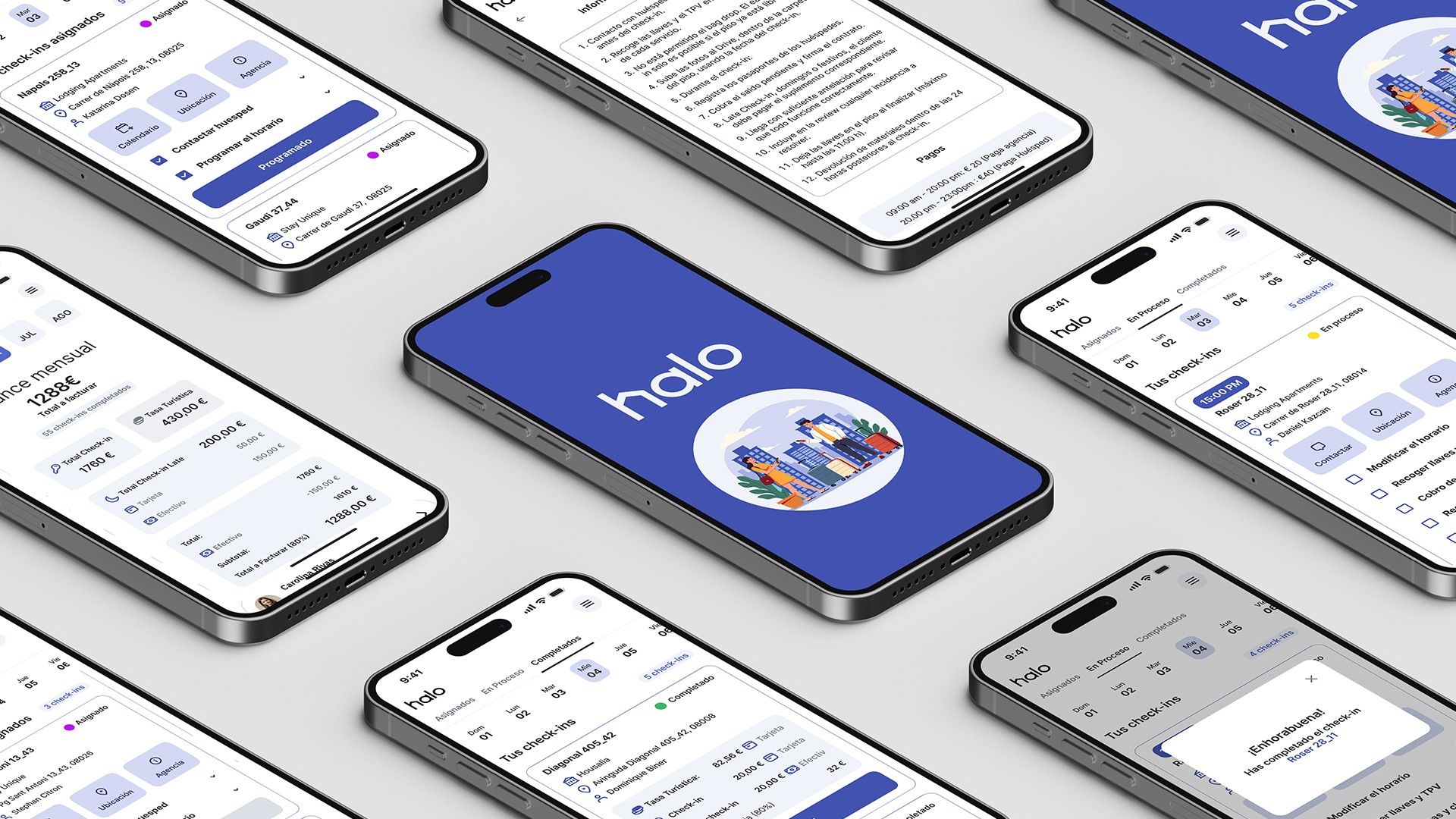
Work / Halo
Halo
Redesigning Halo to reduce errors and cognitive load in time-critical check-in workflows, so operational workers can act confidently on the go.
8 interviews · 3 core task flows redesigned
Background
Effortless check-ins, happy guests
Tourist check-ins often happen under time pressure, in unfamiliar locations, and with incomplete or scattered information. Mistakes are costly and difficult to fix once a task is completed.
Halo is an internal app used by freelance workers managing check-ins for vacation rentals in Barcelona. The project focused on improving clarity, reliability, and error prevention in daily operational workflows.
Over 5 weeks, I collaborated with a cross-functional team to redesign key task flows, helping workers move faster, make fewer mistakes, and feel more in control while on the move.
Strategy
From research insights to product decisions
Problem
Operational workers rely on Halo to complete check-ins quickly and accurately, often under time pressure and on the move.
However, critical information is hard to scan, navigation breaks task flow, and system feedback is unreliable, leading to missed steps, premature completions, and errors that are difficult to recover from.
Goal
Improve the usability and reliability of Halo's core workflows so operational workers can:
- Access and act on essential information at a glance
- Complete tasks in the correct order without ambiguity
- Trust system status and feedback at every step
Ultimately, the goal was to reduce errors and increase confidence when performing check-ins in real-world conditions.
Solution
We redesigned Halo's interface and task flows to support fast, error-resistant decision-making in real-world conditions. Key improvements included:
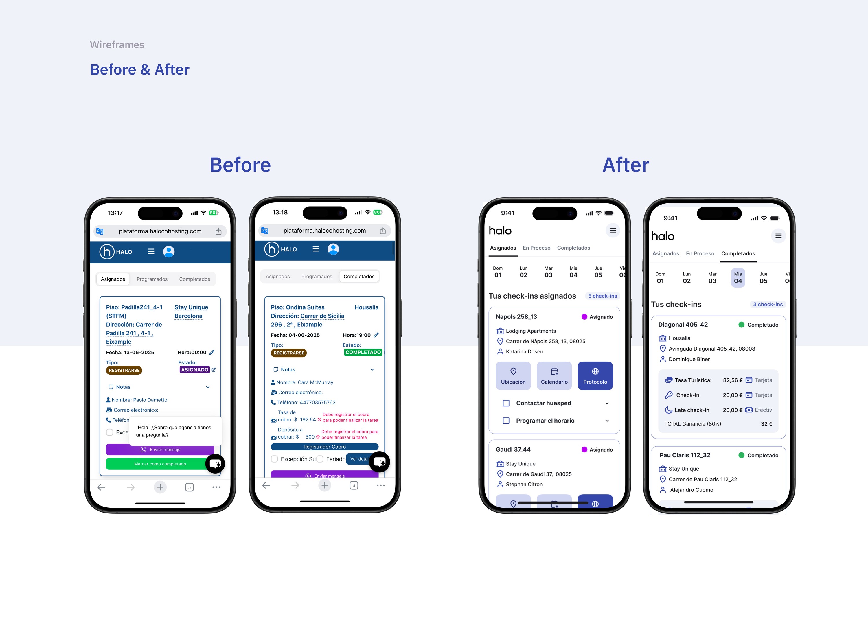
- Clearer visual hierarchy to surface critical information at a glance
- Simplified navigation and task grouping aligned with real workflows
- Stronger system feedback and validations to prevent premature or incorrect actions
- Improved access to financial and status information for better planning
User research
Understanding how freelance workers manage check-ins in real-life conditions
We conducted 8 interviews with operational workers at Halo:
- 7 experienced freelancers working full-time in multiple cities
- 1 operations lead managing remote coordination and logistics
This research directly informed our prioritization of clarity, feedback, and error prevention in critical workflows.
“I want to know how much I'll earn before I accept the job. Right now I'm guessing.”
“Sometimes the check-ins don't update and still show up as assigned even if I already did it.”
“When I copy the address, Google Maps doesn't recognize it. I have to clean it up manually every time.”
User persona
Freelance check-in worker
Alex
“I need an app that helps me stay organized quickly and doesn't waste my time, every minute counts between check-ins.”
- Age
- 28
- Education
- Graphic Designer
- Status
- Single
- Occupation
- Freelance Designer
- Location
- Barcelona
Bio
Alex is 28 years old and works as a freelance graphic designer. In the afternoons, Alex does check-ins at tourist apartments to supplement his income. He values the flexible schedule this job offers. He works from home in the mornings and rides his electric bike around the city in the afternoons to perform check-ins.
Goals
- Manage check-ins quickly and efficiently.
- Easily access all necessary information (time, address, instructions, payments, etc.).
- Avoid missing important tasks between check-ins.
- Know how much they will earn at the end of the week or month.
Pains
- The current app lacks a clear visual hierarchy, making it hard to find information.
- Instructions are scattered and unclear.
- Each agency has different rules, which causes confusion.
- It's hard to copy key data (like phone numbers or addresses).
- The time selector is buggy or inconvenient.
- There are too many unnecessary buttons or actions.
Gains
- Have everything organized in one place, without wasting time.
- Easily visualize the week or see a summary of earnings.
- Do the job with more confidence and less stress.
- Contact guests quickly without losing time.
Journey map
Throughout the journey, users feel confused, stressed, and under pressure due to scattered information and lack of guidance.
This highlighted the need for a clearer and more streamlined experience.
| Assignment & coordination | Pre-check-in preparation | Check-in day: in progress | Check-in completion | Balance and review | |
|---|---|---|---|---|---|
| Actions |
|
|
|
|
|
| Pains |
|
|
|
|
|
| Opportunities |
|
|
|
|
|
| Emotion | Uncertain | Neutral | Stressed | Relieved | Frustrated |
Heuristic evaluation
Conclusions of the heuristic analysis
Visibility of system status
The app lacks immediate feedback on key actions, causing user uncertainty. Clear status updates are needed to keep users informed.
Match between system and the real world
Addresses and data are not aligned with real-world use, leading to confusion. Formatting should match user expectations to reduce errors.
User control and freedom
Users cannot undo or cancel critical actions easily, risking mistakes. Undo options and warnings are necessary for better control.
Consistency and standards
Navigation and design are inconsistent, making the app harder to learn. Consistent patterns improve predictability and usability.
Error prevention
Common errors are not anticipated or blocked, forcing manual corrections. Validations and warnings can prevent costly mistakes.
Recognition rather than recall
Important information is not visually prioritized, increasing cognitive load. Making key data visible aids quick decision-making.
Flexibility and efficiency of use
No filtering or search options limit user efficiency. Adding shortcuts and customization would speed up workflows.
Aesthetic and minimalist design
The interface is cluttered and overwhelming. Simplifying the design helps users focus on essentials.
Help users recognize, diagnose and recover from errors
Error messages are unclear or missing, causing frustration. Clear feedback guides users to fix problems.
Help and documentation
No in-app help is available; users rely on external, hard-to-access resources. Integrated support would improve user autonomy.
Key insights
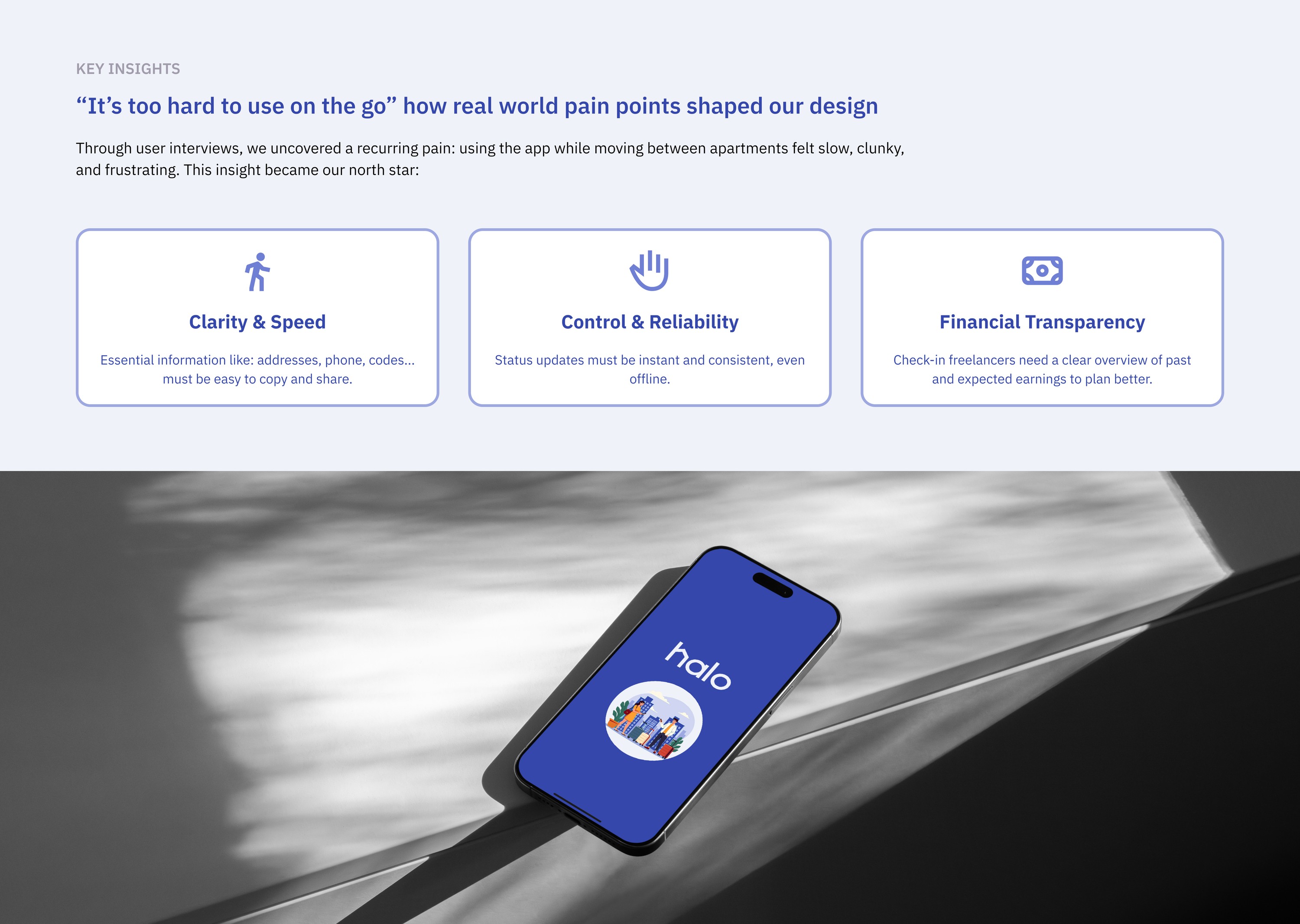
"It's too hard to use on the go": how real-world pain points shaped our design
Through user interviews, we uncovered a recurring pain: using the app while moving between apartments felt slow, clunky, and frustrating. This insight became our north star:
Clarity & speed
Essential information like addresses, phone numbers and codes must be easy to copy and share.
Control & reliability
Status updates must be instant and consistent, even offline.
Financial transparency
Check-in freelancers need a clear overview of past and expected earnings to plan better.
Information architecture
Enhancing user access and navigation
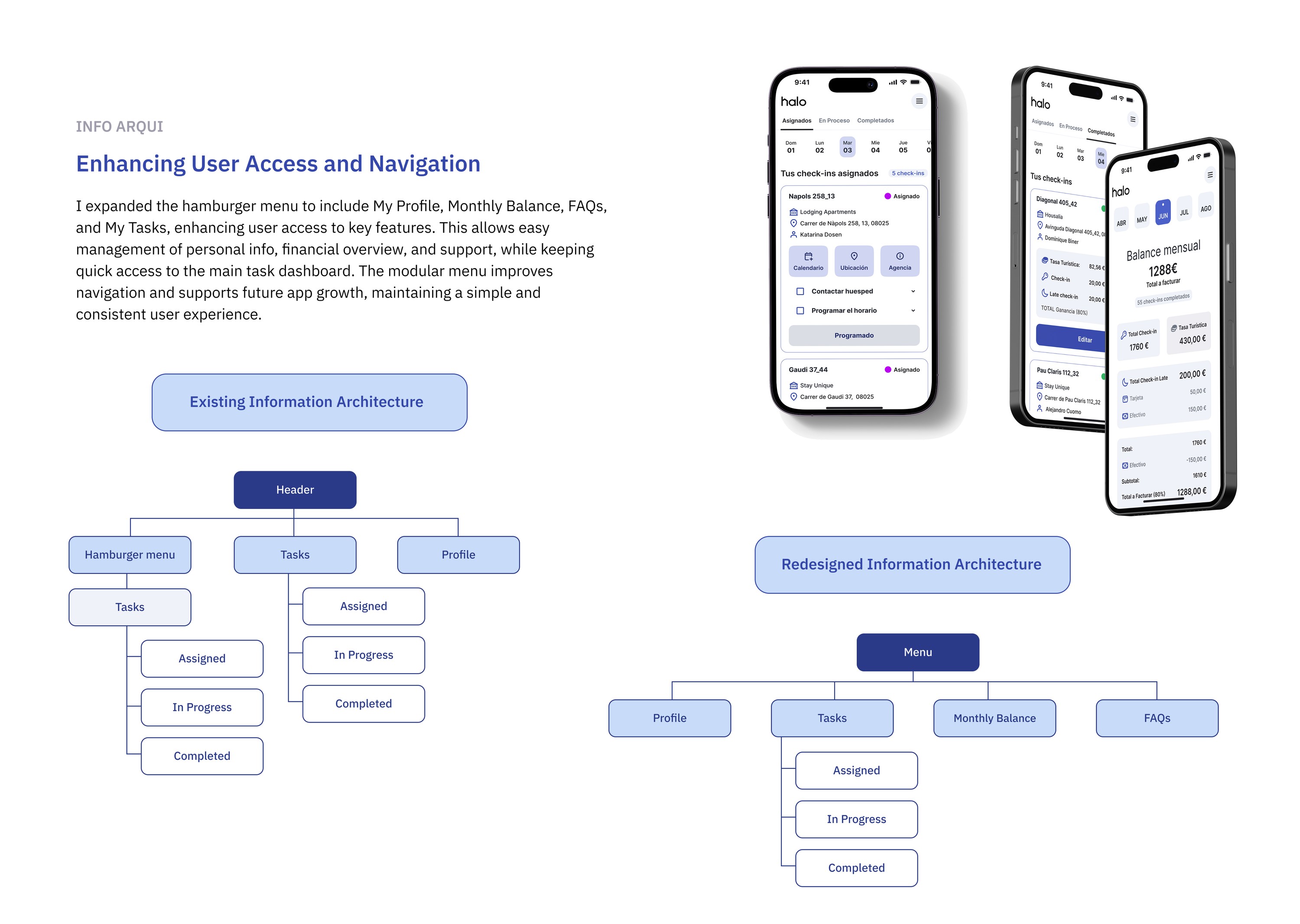
I expanded the hamburger menu to include My Profile, Monthly Balance, FAQs, and My Tasks, enhancing user access to key features. This allows easy management of personal info, financial overview, and support, while keeping quick access to the main task dashboard. The modular menu improves navigation and supports future app growth, maintaining a simple and consistent user experience.
- Header
- Hamburger menu
- Tasks
- Assigned
- In progress
- Completed
- Tasks
- Tasks
- Assigned
- In progress
- Completed
- Profile
- Hamburger menu
- Menu
- Profile
- Tasks
- Assigned
- In progress
- Completed
- Monthly balance
- FAQs
Task flows
Simplifying the three most frequent tasks
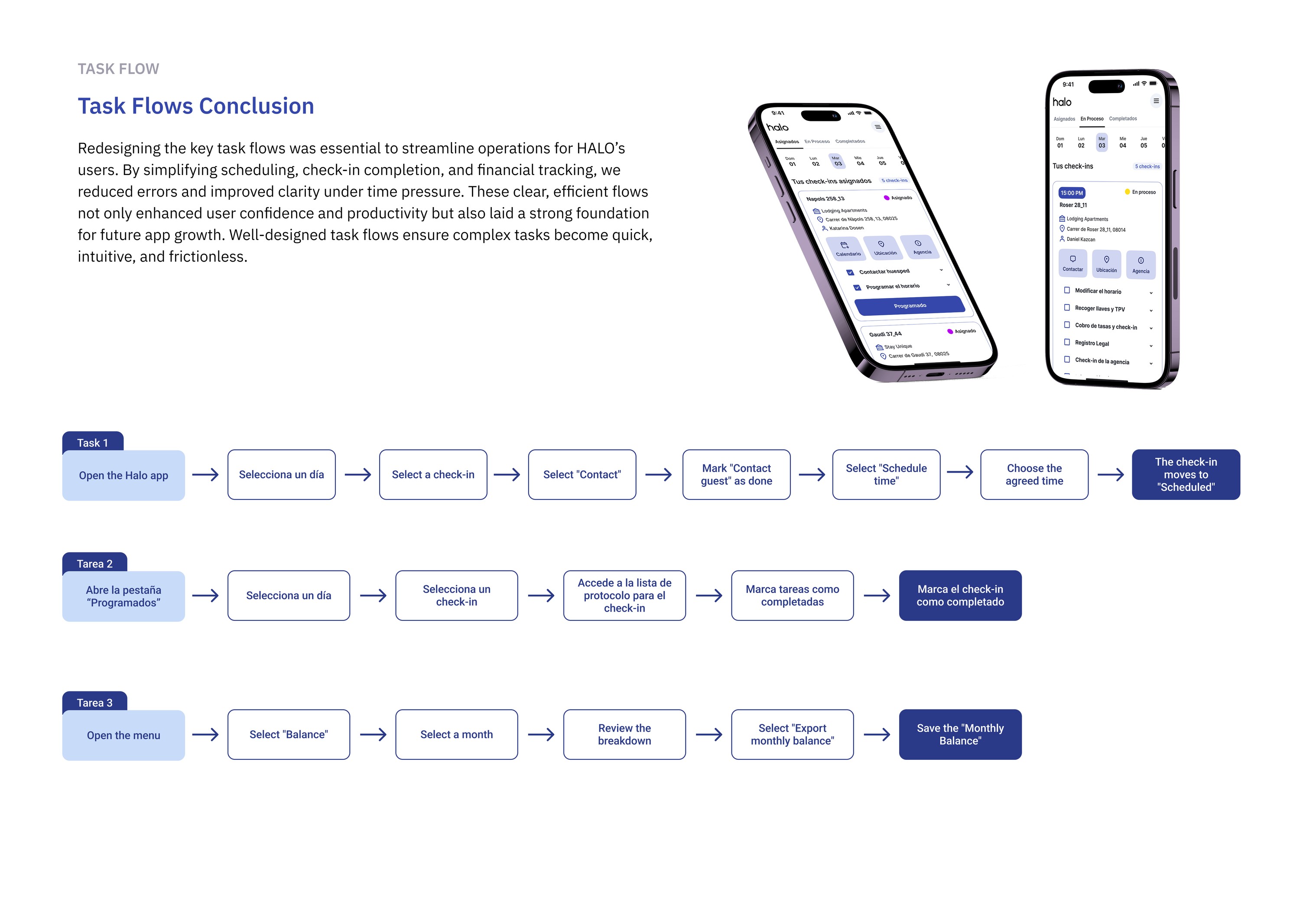
Redesigning the key task flows was essential to streamline operations for Halo's users. By simplifying scheduling, check-in completion, and financial tracking, we reduced errors and improved clarity under time pressure. These clear, efficient flows not only enhanced user confidence and productivity but also laid a strong foundation for future app growth.
Schedule a check-in
- Open the Halo app
- Select a day
- Select a check-in
- Select "Contact"
- Mark "Contact guest" as done
- Select "Schedule time"
- Choose the agreed time
- The check-in moves to "Scheduled"
Complete a check-in
- Open the "Scheduled" tab
- Select a day
- Select a check-in
- Open the check-in protocol list
- Mark tasks as completed
- Mark the check-in as completed
Export the monthly balance
- Open the menu
- Select "Balance"
- Select a month
- Review the breakdown
- Select "Export monthly balance"
- Save the monthly balance
UI design
Design system
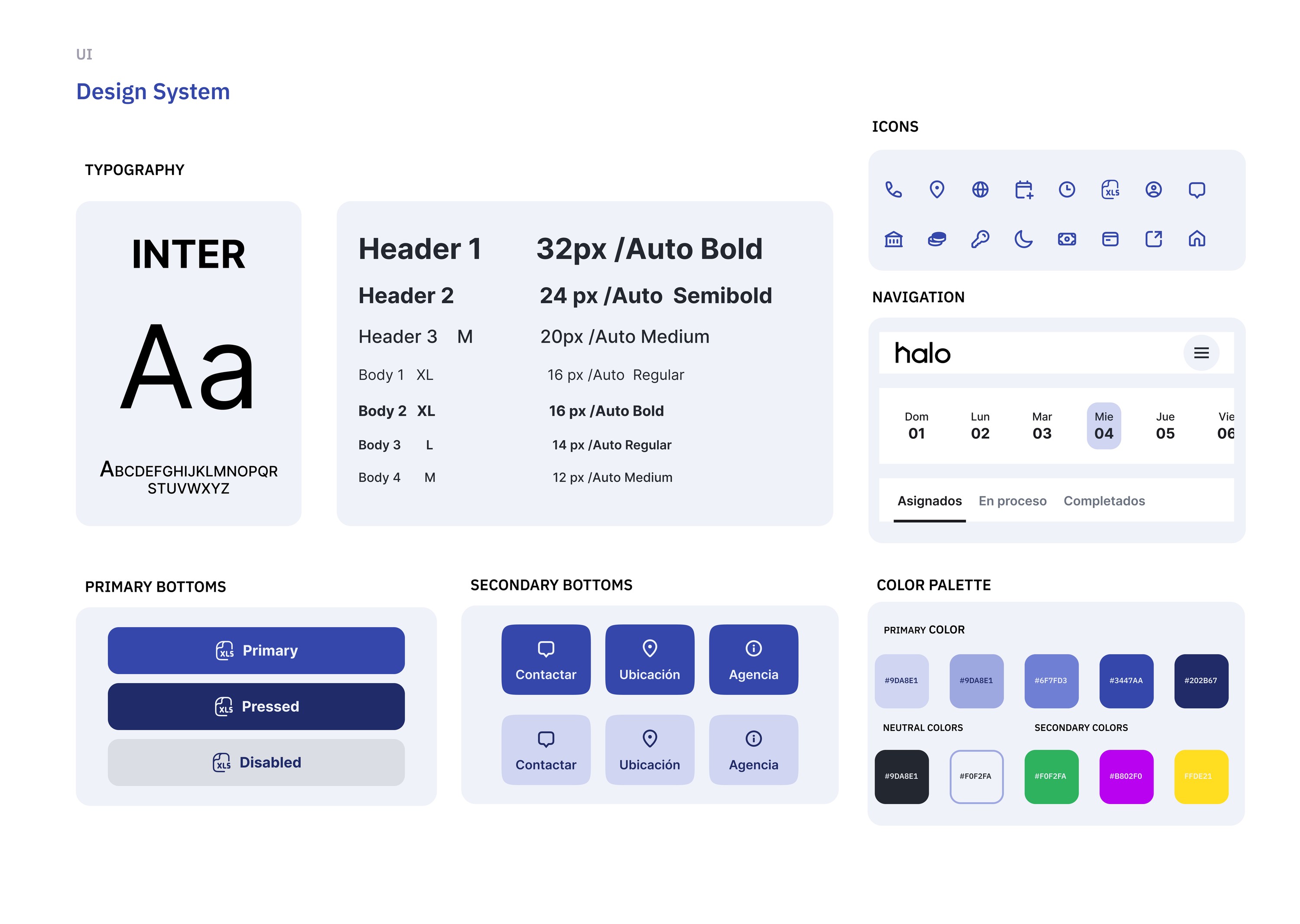
A compact system built on Inter, with a single primary blue, neutral surfaces and clear button states, so every critical action reads the same way across the app.
Wireframes
Before & after